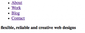
Playing around I disabled CSS and Javascript on my site:
Hm.. what's the problem? Well .. it is presentational stuff that shouldn't show up in a html-only view. A mobile device user will have to scroll through these image. An iphone would be served better with only text and maybe some small images.
Cause? - I naively put images (img tags) into my html, this way mixing content with presentation. First I got the images out so that html-only view would not show them:
.. far more compact for a mobile device. Under the phrase, the text starts,
saving mobile device users a lot of scrolling.
Then I used CSS to put one image when only CSS was on:
.slideshow { position: relative; float: right; height: 150px; width: 425px;
background:url("../images/bambu/bambu4.jpg") no-repeat top left; }
This way, when there is CSS one image is shown occupying the class the slideshow div in the html document.
Then the full solution, bonus for the people (still the majority of course) that has Javascript turned on. The key is to let Javascript do all the work:
1. add the images with JS storing them in a variable
var imagePresentation = '
<img src="images/bambu/bambu1.jpg" alt="banner with photo slideshow of bambu trees"/>
<img src="images/bambu/bambu2.jpg" alt="banner with photo slideshow of bambu trees"/>
<img src="images/bambu/bambu3.jpg" alt="banner with photo slideshow of bambu trees"/>
<img src="images/bambu/bambu4.jpg" alt="banner with photo slideshow of bambu trees"/>
<img src="images/bambu/bambu5.jpg" alt="banner with photo slideshow of bambu trees"/>';
2. add them to the document object model (DOM)
$('#slideshowImages').append(imagePresentation);
(#slideshowImages = the container division reserved for the images.)
Now we have a good result for all three layers of the progressive enhancement model:
1. mobile devices or text-only browsers see only text. There is an empty #slideshowImages div block, that you could take out as well, but I use that for my CSS
2. browsers that have CSS turned on but not JS have a single background image in the banner:

3. browsers that support CSS and Javascript see all 5 images rotating - see my site. By the way, the rotation of images is thanks to the jQuery Cycle Lite Plugin
Conclusion: temptation is to put presentational stuff in too early. But knowing that at the end of the day, you have to go back to make hacks for wider compatibility, why not start at the very basic: the document structure (html). Then add a presentational layer with CSS decorating the content. At last put some interactive functionality adding Javascript. This way, you can at least be sure that all will work in a wide range of browsers even if Javascript or CSS is not there.
I need to check my site for more of these drawbacks. Probably I will add a stylesheet in the future to optimize for mobile devices. You can easily target these devices doing something like this:
<link rel="stylesheet" type="text/css" href="iphone.css"
media="only screen and (max-width: 480px)" />
<link rel="stylesheet" type="text/css" href="desktop.css"
media="screen and (min-width: 481px)" />
(from Building iPhone Apps with HTML, CSS, and JavaScript ..
from Jonathan Stark)
If you want to know more about progressive enhancement there is a good article at Sitepoint: where javascript fits in
Next post on IE6 quirks. IE6 might be dead, there are still visitors of my site with this browser and I need to make some adjustments to give them the same experience as the IE7+ users.


