Today more and more people browse the web via a mobile device. This means for each new design we need to take into account how the design looks on such a device. There are many ways to do this. CSS is highly flexible so using percentage widths and floats, content drops when the screen size becomes smaller. Cool.. but budget, time and knowledge don't always allow to make a second investment for a mobile version. That's where mobilize tools come into play.
In August I posted about Mobify, a tool to roll your own mobile version selecting the divs from your site and style them. This took some time but had the advantage of being highly customizable. Today I show the other way around: a more standard way that is much faster and simpler. You can have a mobile version online in only 2 minutes without doing geeky stuff. Meet GMBHnews, a tool designed to create a mobile version of your site based on its RSS feed.
Why should I use this?
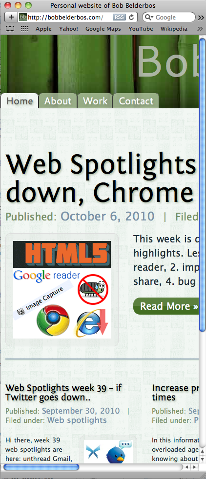
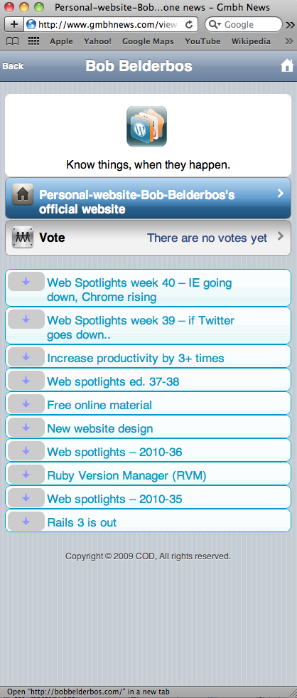
Compare these two mobile versions and it should be clear that it's not just an afterthought to tweak a little and give our visitors a chance to read our content better:
[caption id="attachment_479" align="alignleft" width="295" caption="design intact but lot of scrolling required"] [/caption]
[caption id="attachment_480" align="alignleft" width="293" caption="content is better viewable this way"] [/caption]
Howto
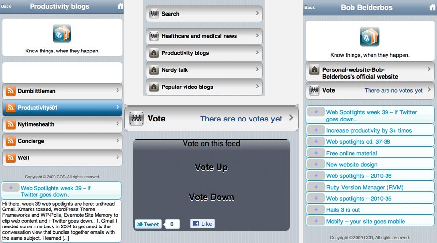
So to start off you need a feed URL. If you use Wordpress, you have this already set up, if not you can roll your own, there are plenty of manuals available, for example this one. Then you simply sign up and you get an unique URL assigned, mine is http://www.gmbhnews.com/view/Personal-website-of-Bob-Belderbos.html. After clicking the "mobilize now" button, you are presented with a code snippet you can put in the header of your site. It will redirect all mobile traffic to your GMBHnews URL. The structure of you mobile site looks like Google reader, see some printscreens below: you have the titles you can toggle open.
[caption id="attachment_484" align="aligncenter" width="630" caption="some printscreens of gmbhnews"] [/caption]
Strengths and weaknesses
So playing with this last week, I found some advantages / disadvantages:
Advantages
-It is simple and fast: sign up with your RSS feed and you're done. Put the snippet in your page, and routing goes automatically, detecting if a mobile device browses your site. I only tested it with iphone and the redirect works after putting the snippet in my footer (I prefer to put JS in the footer to gain performance). In case of my customized Wordpress theme I had to create a hook to add the code to my footer:
 // mobile version gmbh
function childtheme_gmbh() { ?>
<script type="text/javascript">
(function(){var c=navigator.userAgent
.. ..
browser detection code ..
a.href="h
http://www.gmbhnews.com/view/Personal-website-of-Bob-Belderbos.html?i=COMR
.. ..  </script> <?php } add_action('wp_footer', 'childtheme_gmbh');

-It's RSS-based. New content will be displayed instantly on your mobilized site. No manual updating required.
-Social media integration. People can vote your site sharing it on twitter or facebook. Hopefully this will be integrated on a per-article-basis, but in my case, having the share buttons below the articles, they are visible anyway.
-Your blog will be included in GMBHnews. This might generate more traffic to your site. You can host various blogs/ RSS feeds. This is an advantage for big companies with hundreds of blogs/ feeds. Visit GMBHnews for examples.
-You can monetize the traffic with adsense or private custom ads. This is interesting for site owners as well as publishers.
- One solution for a great variety of mobile devices. Sign up once and done. The simplicity of the standard template makes it quite robust. No compatibility nightmares if you'd go with a customized design, you're all set. And I think that with mobile devices the focus is on content, it's just a matter what comes first when screen real estate is (severely) limited.
-SEO friendly structure of the site URLs to gain additional traffic: it respects title + description + keywords and google likes that


Disadvantages:

-It's one standard design, you cannot customize its look nor feel with CSS. If you want the same look as your site, choose a more specialized way. If you want that you could use Mobify which let you select divs and play with the underlying CSS. This is not for techies that like to play with their design, load a separate stylesheet and do your any nifty CSS stuff

For anybody who wants to go with an advanced solution, you might check out O'Reilly's HTML5 Mobile Web Development
-It's RSS-based. If you don't have a blog but a portfolio with photos, this text-based service is probably not for you.
-I had some issues with smileys displaying too big and images not showing up, maybe a linking issue. Also I had some issues with the social media buttons. I guess, as the app is still in Beta phase, this will be all sorted out in future releases.. As I am using this solution for now, any issue I report to support. I tend to get a quick and helpful response.
-Unlike other services it's free for 30 days (trial) then you'll have to pay a monthly fee, starting at $ 9/month. It's not expensive though, if you start to monetize your site you can earn it back and even more.
Conclusion
If you are a CSS ninja that wants to have his/her mobile counterpart look the same, don't try this. If you want to manage various blogs and you want to recognize the mobile browsing market-share, but without loosing much time, this might be an interesting option for you.
I like it as a quick solution right now, and the upcoming web makes this quite a valuable service. However, personally I like to hack so I think in the end I will come up with a customized html5/css solution. The problem is that it will cost extra time and effort.
As there is a free trial, you don't loose anything by signing up and trying it yourself. Let me know what you think ...

