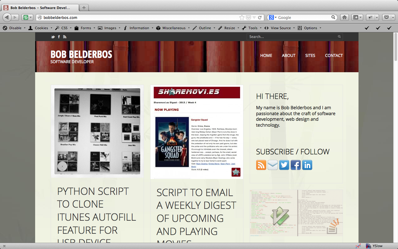
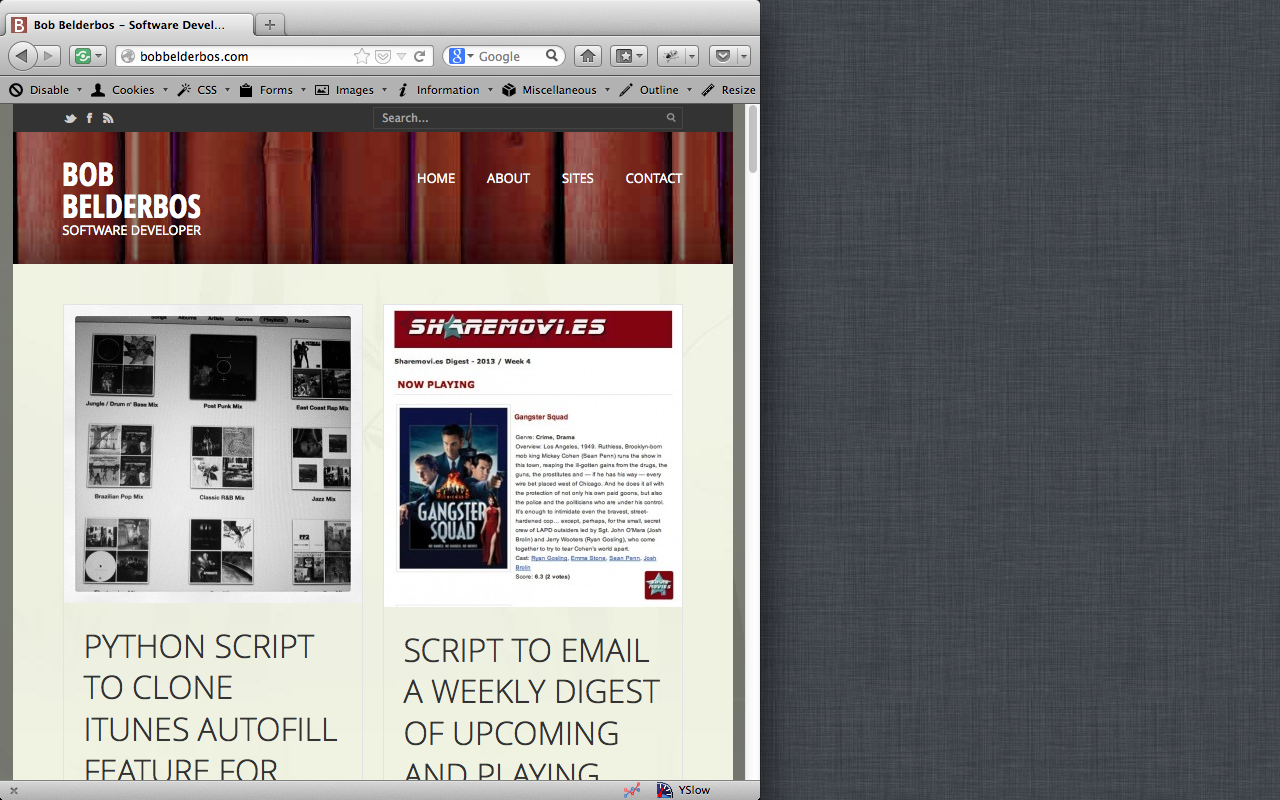
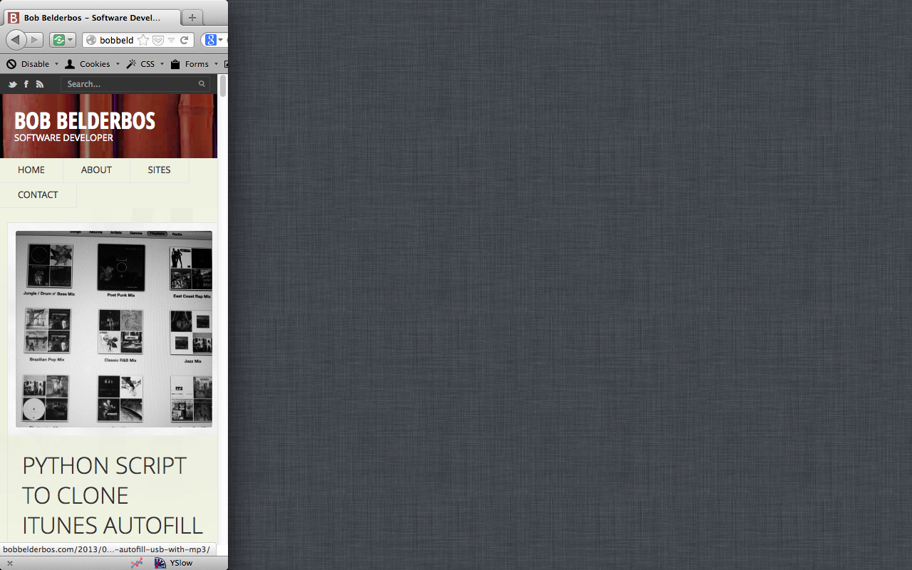
As you see I adopted a new theme for my website / blog. Reason? Responsive web design. I want my site to be easily accessible on a desktop, tablet and smartphone.
Responsive is hot
Mashable predicted that 2013 is the Year of Responsive Web Design. And it is true, more websites are converting to this solution:
- The default Wordpress theme, Twenty Twelve is fully responsive;
- Zenhabits.net released a simple yet elegant theme which uses media queries;
- Popular webdev sites like Mashable and Smashing Magazine are fully responsive;
And it makes sense with the increasing amount of mobiles and tablets browsing the web. I do a lot more reading now on the phone/tablet myself, plus visits from these devices increase. Hence it was time for my site to be responsive as well!
Re-use or build from scratch?
Both options are interesting, but there are some very good templates: for Wordpress the mentioned 2012 theme or the Responsive Theme. I decided to use Morten Rand-Hendriksen's Anaximander theme which he builds from scratch in the Lynda course WordPress: Building Responsive Themes.
Apart from providing an awesome theme you can adapt for your blog, this course is really insightful how to build an advanced responsive Wordpress theme from scratch. It has some slick features, for example the dynamic homepage (fall-in-place-when-resize) layout using masonry.
Soon however I will restyle one of my projects from scratch (I am thinking of My Reading List) to be responsive.
Where to start? Resources: apart from looking at the CSS of the WP themes and mentioned Lynda course, I recommend starting with Ethan Marcotte's article on responsive webdesign and his book on the subject which I discussed here.
Look and compare ...
In the old design resizing would overlap the right sidebar. The new design uses media queries and a flexible grid to adapt to any size. It sets max-width: 100% on the images so they scale, see the images in this post, or resize the browser, or enjoy a better view of my blog if you are reading this on a tablet or phone :)


- bobbelderbos.com (1) ,
- design (11) ,
- lynda (1) ,
- masonry (1) ,
- responsive (2) ,
- theme (1) ,
- web (1) ,
- wordpress (12)
