Mobify lets you make a mobile version of your website. I've yet to discover other tools as mofuse and apple's sdk, but my first touch with Mobify was quite positive. What I like is the flex html/css editing with direct preview in a mobile screen simulating pane.
In this post I'll give a short impression what I could build in a relatively short amount of time. I probably will dedicate a second post to wrap up the more advanced stuff and/or more advanced mobile development with the tools mentioned above or pure HTML/CSS/JS
Quick how-to
So how simple is it? (screenshots below ..)
- Get a (free) Mobify account
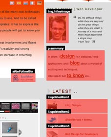
- Choose a site and pick the areas you want to appear in the mobile version
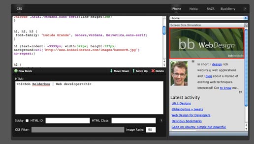
- Go to Design and waken up the CSS ninja in you ;) .. you can customize the areas you choose pixel-precisely. You can also add new (HTML) ID elements.
- Then under Manage you can define you mobile URL, be it on your domain (requires some DNS tweaking) or via Mobify. I choose bbbb.mobify.me (bb had already been taken).
- A cool feature is a redirection you can set up on your site. Mobile devices get detected and are redirected to your mobile page. Put the following snippet just above the </head> tag on your site:
<script type="text/javascript"
 src="http://mob-view-name.mobify.me/mobify/redirect.js">
</script>
<script type="text/javascript"> try{_mobify("http://mob-view-name.mobify.me/");} catch(err) {}; </script> - You're done. Optionally you can integrate google stats.
Tutorials
Online starter tutorial .. and more tutorials here
Some sidenotes ..
Ah yeah.. up until here the service is free. I read you need to upgrade to a (paid) PRO account to insert Javascript to your mobile page. I don't know if I would take a mobile site to that level.
On first sight I thought the html events were just statically copied, but this is not true. I changed something on my homepage and the mobile page changed with it. So the html blocks you select under 2. are dynamically linked back to the site. This is quite nice!
An alternative is loading a separate stylesheet
An alternative is load the same page but with a separate stylesheet. You can then benefit from mobile browsers native JS support (= not upgrading to a Mobify PRO account)
See at the end of this post how this could be done. The book mentioned there is defintely on my reading list :D
(to be continued ..)
Sounds fun, but could you give me some images?
Some printscreens below:
[caption id="attachment_162" align="aligncenter" width="227" caption="pick the areas from your site you want to appear in your mobile version"] [/caption]
[caption id="attachment_161" align="aligncenter" width="516" caption="after selecting content, you can edit css and add more IDs"] [/caption]
Result:
http://bbbb.mobify.me/[caption id="attachment_163" align="aligncenter" width="243" caption="result a perfectly (iphone) aligned web site with just the essential stuff (yep.. KISS)"] [/caption]
