

In this post some simple CSS to get you started with a fixed sidebar or header design. I think it is a nice design option. I used the fixed header for my portfolio site. I found a fixed sidebar example at fooljs.com.
I like how Facebook and Twitter have a header with small height and how it always stays on top and in place when you are scrolling the content. In this post I will give you an example of this and of a fixed sidebar. The code can be downloaded from github or, as it is HTML/CSS, you can browse the files here
** I will use the Codesnippets repository on Github from now on to share blog and other code examples. I will migrate some of the code I have at http://bobbelderbos.com/src (previous posts) to have everything stored in one place.
Start clean
I first include a reset.css to wipe out any browser default styles. I think this is one of the best things you can do when starting to write CSS, to not find any surprises ("huh? it looks different even between modern browsers!") later on.
Next, you can get a simple HTML5 template from this Sitepoint post. For bigger projects I tend to use the HTML5 boilerplate which includes a lot of best practices. So we are going to use some very simple markup, to provide the CSS necessary to get to these two layouts.
The markup
See here. We have a "nav" item that is the fixed content, a "content" div that holds "main" and "footer".
	<nav>
	<h1>Fixed header</h1>
	<h2>Subheader</h2>
	<ul>
	..
	</ul>
	</nav>

	<div id="content">
		<div id="main">
			..
		</div>

		<footer>
			..
		</footer>

	</div>
Where are my content blocks?
A simple trick I use regularly is to put temporary borders around the building blocks of my sites:
  /* markers for design */
	nav {
		border: 1px solid #999;
	}
	#content {
		border: 1px solid red;
	}
	footer {
		border: 1px solid blue;
	}
CSS fixed sidebar
See here
  nav {
  	position: fixed;
  	left: 0;
  	top: 0;
  	bottom: 0;
  	background: #f2f2f2;
  	width: 180px;
  	padding: 10px;
  }
  ..
  #content {
  	margin: 0 0 30px 210px;
  	background-color: #eee;
  }
  #main {
  	padding: 10px;
  	line-height: 20; /* to fake lot of content / scrolling */
  }
  footer {
  	width: 100%;
  	background-color: #ddd;
  	position: fixed;
  	bottom: 0;
  	left: 200;
  }
- The position: fixed; in nav is responsible for taking the element out of the document flow and stick it to the position that you specify by left/top/bottom.
- You have to give a left margin to the #content that comes right of the fixed sidebar, in this case : the width of nav = 180px + its left and right padding = 2x 10px + and extra 10px = 210px total.
- The footer spans the whole width: 100%. Same here: position: fixed; + bottom: 0; make it stick to the bottom. I gave it a background-color so that you cannot see the content underneath it. A half-transparent background for the footer like http://fooljs.com/ is a nice option as well.
CSS fixed header
See here
  nav {
  	position: fixed;
  	left: 0;
  	top: 0;
  	background: #f2f2f2;
  	width: 100%;
  	heigth: 20px;
  	padding: 10px;
  	z-index: 20;
  }
  ..
  #content {
  	position: relative;
  	top: 40px;
  	background-color: #eee;
  	z-index: 10;
  }
  #main {
  	padding: 10px;
  	line-height: 20; /* to fake content with a huge height without much clutter content */
  }
  footer {
  	width: 100%;
  	background-color: #ddd;
  	position: fixed;
  	bottom: 0;
  	left: 200;
  }
- Same comment on nav as previous example, but I got rid of bottom: 0; and put a height (20px + 10px all-round padding = 40px) and width (100%) in so it is a small header bar across the whole width of the site, like Facebook
- I positioned the #content under the header with position: relative; top: 40px;
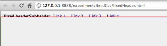
- Very important is the stacking of elements. Out of the box the #content would overlap the header when scrolling down:
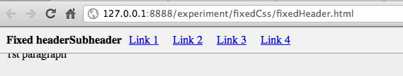
After setting the stacking order with z-index it is better. As w3schools explains: "An element with greater stack order is always in front of an element with a lower stack order."
So by giving "nav" a bigger z-index it stacks on top of #content. Interestingly I found out last week that, if you use plugins like Fancybox you should be conservative with this value. They use 100 for z-index, so when using the max. of 9999 for a block, that block will always sit on top, be careful there!
nav {
	z-index: 20;
}
#content {
	z-index: 10;
}
After this CSS it is much better:
And that is it: two simple templates to start a web design with a fixed vertical or horizontal navigation.
