

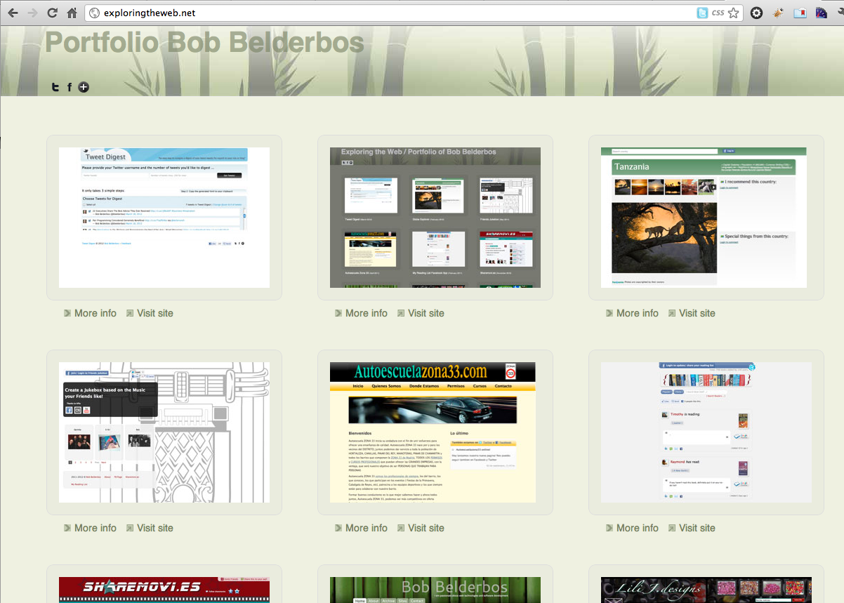
Last week I finished my new portfolio design. It shows some websites I have built the last couple of years. As my blog I integrated bamboo in the design. There is a light and dark theme. And most important it is responsive: it is compatible with the iphone and ipad.
Before designing this portfolio site, I used a Wordpress plugin which was pretty good. The downside was that I could not fully control the look and feel of your portfolio. That's why I designed something myself!
I started to take screenshots with this nice command line tool.
Then I used the HTML5 boilerplate and reset.css to get optimal defaults. I use both tools for every site now, and it is really prevents headaches later on in the process. Big thanks to the developers of these tools!
The fetching of the works is done with PHP and a MySQL Database backend.
Functionality
- Click on a thumbnail and you can browse through a carousel of all the works (done with Fancybox).
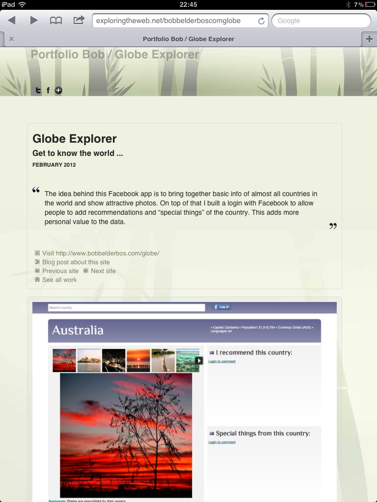
- Under each work is a link to its page which is a slug based on the website's URL (for example exploringtheweb.net/bobbelderboscom). Clean URLs is another practice I use often and are done with a simple RewriteRule in .htaccess. On the work's page you can read about the site, browse to the next/previous project, etc. It also links to any related blog if it exists. Examples: Friends Jukebox or Globe Explorer
- In the footer there is a Feedback link that slides a Facebook Comment box open when clicked. You can also change the theme from: light to dark or vice-versa in the footer of the site. This sets a session variable and/or cookie to remember the theme you have selected. I first had the themes toggle each day when you'd enter the site, but I decided that I liked the light one better, so I left that as the default.
Media queries
As discussed earlier on my blog media queries can be quite powerful. I only made basic use of them, yet with sufficient result: the portfolio site supports ipad and iphone! It is done by targeting different stylesheets upon detection of the device width of these devices:
<link rel="stylesheet" href="css/iphone.css"
  media="only screen and (max-device-width: 480px)" type="text/css">
<link rel="stylesheet" href="css/ipad.css"
  media="only screen and (min-device-width : 768px) and (max-device-width : 1024px)"
  type="text/css">
These stylesheets then overwrite / add styles on top of the main styleseet.
Below you can see some printscreens how the site scales on different devices:
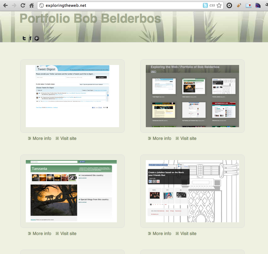
1. Benefit screen estate: the Desktop
You see that the wider your screen the more works you see. This is done with a simple left float.
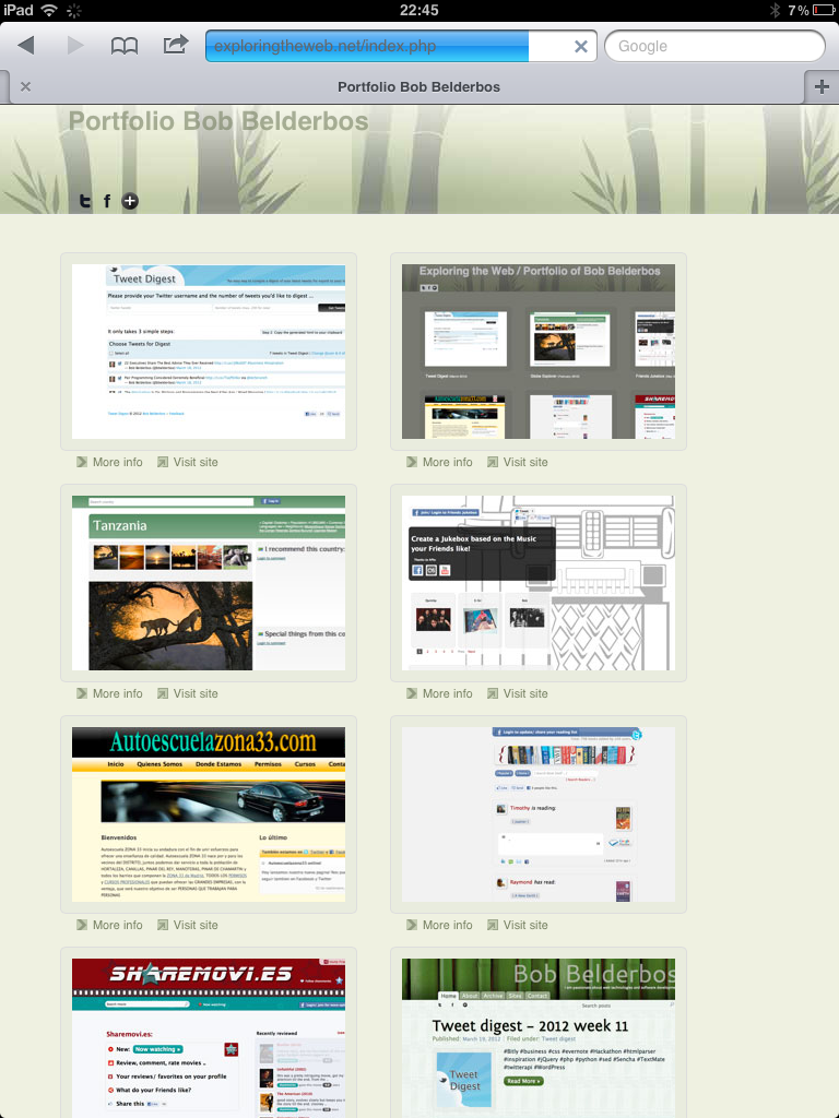
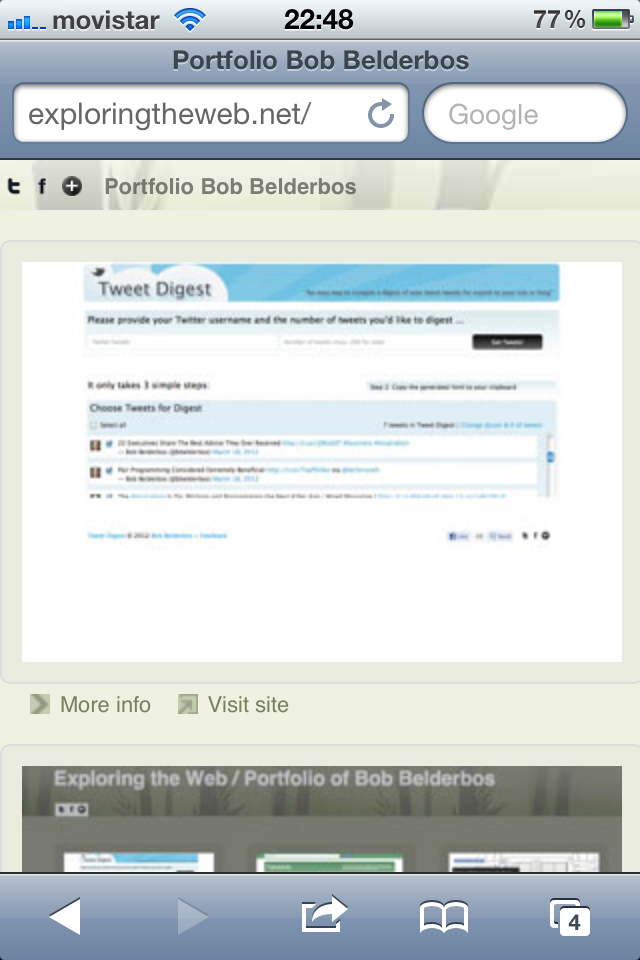
Homepage:
Homepage resizing the browser:
This is the experience of looking at a work's site:
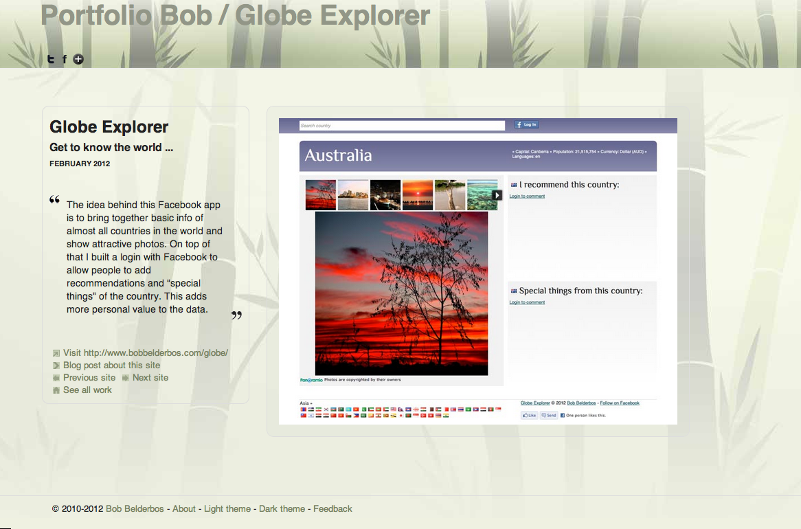
You see the description is at the left side, where on mobile devices it moves on top of the image.
2. Go smaller but mobile: Ipad
Ipad has two columns per default on the homepage.
On the work pages you see the text scales above the picture:
3. In your pocket, but be compact: Iphone
On the Iphone the homepage has a single column of works:
Secondly on a work's page the text is also placed above the image. Note that also the header is smaller to gain screen estate:
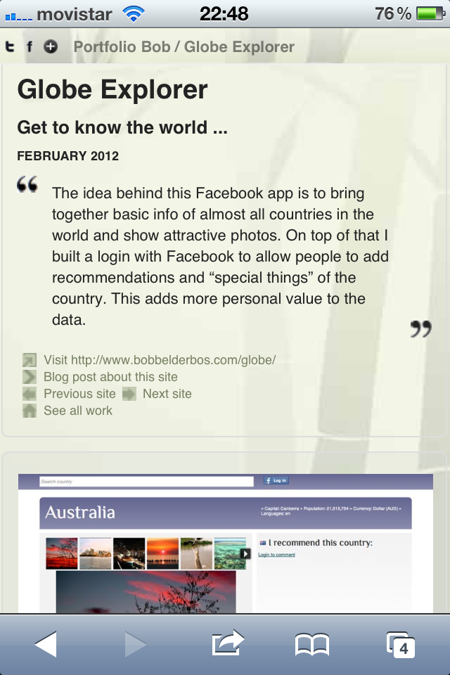
Also note that the header has a fixed position so content scrolls behind it. See here how I did this. It is one of the details I like most about this design.
Let me know if you have any comments or suggestions. A followup plan could be to extend this site to let:
- users create their own portfolio site, potentially with a subscription option to have your unique URL at http://exploringtheweb.net. A challenge is how to process portfolio images, you take them with a tool like webkit2png which generates pretty heavy images, or you let your users upload their images. I think the latter is most practical in the end. I had to manually optimize the images for the web, because they were taking too much time to load.
- users edit the default design with a theme builder so that they can leverage the power of this layout but with customized banners, colors, fonts, etc.
