Rails 3 is out

An important day for the ruby on rails community!

Intro video

New features

Viewing the screencasts we see some nice features built into rails 3:

  • Refactored Internals: a minimal functional core vs. extended functionality.
    Rails3 has a microkernel architecture with additional libraries.
  • New/cleaner routing structure which is rack compatible. Rack basically entails a simple interface for handling HTTP requests in Ruby. Rails Metal, one of the results of the move to Rack, provides a way to bypass some of the normal overhead of the Rails stack, allowing a developer to specify certain routes and code to execute when those routes are hit (see Rack support in Rails: Why It Matters)
  • ActiveRelation: new syntax for queries, for example the much shorter Post.where(:published => true) is a clean example of querying your data source.
  • Rails 3 ships with Bundler, a Ruby library that makes Dependency Management less painless because dependencies are better dealt with than Gems (see nice graphical illustration in the screencasts)
  • ActionMailer has its own app/mailers folder and has (among a lot of other cool stuff) automatic mime-type detection
  • Cross-site scripting (XSS) protection is offered by automatic string escaping / cross-site request forgery is prevented by protect_from_forgery
  • Unobtrusive javascript (UJS)
    • HTML5 custom data attributes (data-* tags) are integrated saving a lot of markup (instead of a crap-load of html, just one data-..=".." tag).
    • Support for more JS frameworks. You can easily integrate jQuery by getting the jquery ujs driver

More info

Ah by the way ..

As I posted here, I started to learn Ruby on Rails. Important is to gain a profound Ruby knowledge! Reading the rails source will become fundamental in becoming a good rails developer.
I want to share this post with you for anyone learning Ruby on Rails: what are great sources to really get going with Ruby ..

From here on ..

Tell me about your ruby on rails experience and how rails3 will improve it..

Mobify – your site goes mobile

Mobify lets you make a mobile version of your website. I've yet to discover other tools as mofuse and apple's sdk, but my first touch with Mobify was quite positive. What I like is the flex html/css editing with direct preview in a mobile screen simulating pane.

In this post I'll give a short impression what I could build in a relatively short amount of time. I probably will dedicate a second post to wrap up the more advanced stuff and/or more advanced mobile development with the tools mentioned above or pure HTML/CSS/JS

Quick how-to

So how simple is it? (screenshots below ..)

  1. Get a (free) Mobify account
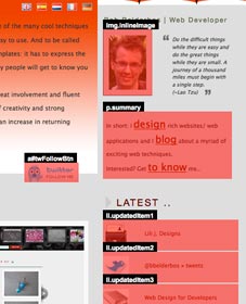
  2. Choose a site and pick the areas you want to appear in the mobile version
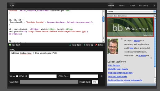
  3. Go to Design and waken up the CSS ninja in you ;) .. you can customize the areas you choose pixel-precisely. You can also add new (HTML) ID elements.
  4. Then under Manage you can define you mobile URL, be it on your domain (requires some DNS tweaking) or via Mobify. I choose bbbb.mobify.me (bb had already been taken).
  5. A cool feature is a redirection you can set up on your site. Mobile devices get detected and are redirected to your mobile page. Put the following snippet just above the </head> tag on your site:
    <script type="text/javascript"
     src="http://mob-view-name.mobify.me/mobify/redirect.js">
    </script>
    <script type="text/javascript">
     try{_mobify("http://mob-view-name.mobify.me/");} catch(err) {};
    </script>
  6. You're done. Optionally you can integrate google stats.

Tutorials

Online starter tutorial .. and more tutorials here

Some sidenotes ..

Ah yeah.. up until here the service is free. I read you need to upgrade to a (paid) PRO account to insert Javascript to your mobile page. I don't know if I would take a mobile site to that level.

On first sight I thought the html events were just statically copied, but this is not true. I changed something on my homepage and the mobile page changed with it. So the html blocks you select under 2. are dynamically linked back to the site. This is quite nice!

An alternative is loading a separate stylesheet

An alternative is load the same page but with a separate stylesheet. You can then benefit from mobile browsers native JS support (= not upgrading to a Mobify PRO account)
See at the end of this post how this could be done. The book mentioned there is defintely on my reading list :D

(to be continued ..)

Sounds fun, but could you give me some images?

Some printscreens below:

[caption id="attachment_162" align="aligncenter" width="227" caption="pick the areas from your site you want to appear in your mobile version"]selecting content[/caption]

[caption id="attachment_161" align="aligncenter" width="516" caption="after selecting content, you can edit css and add more IDs"]css editing[/caption]

Result:

http://bbbb.mobify.me/

[caption id="attachment_163" align="aligncenter" width="243" caption="result a perfectly (iphone) aligned web site with just the essential stuff (yep.. KISS)"]mobile web site[/caption]

Gedit on Ubuntu: simple but powerful

(non-Linux / -Ubuntu users might skip this post.
Linux programmers or text editor fans, read on.. )


Text editors.
.

Holy wars are going on to determine which one is best.

Gedit

For me, on the Mac, TextMate wins on all terrains.
I don't use Windows a lot and less for programming so I cannot really judge (I have a Windows 7 netbook that is so slow -even after tweaking its BIOS and OS settings- that I do not even think of making a webapp on it)

Linux, and in particular Ubuntu, is my second favorite developer OS.
I use it regularly and today I came to know gedit a bit better.
I was surprised how close it comes to TextMate when you tweak it a bit with default + additional plugins.
Just activate the extra plugins after having installed them with apt-get (or your Linux flavor's package manager)

$ sudo apt-get install gedit-plugins

Some neat features

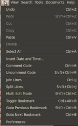
I found Gedit already a comfortable text editor. I had already the filetree and I could toggle between tabs with alt-1 alt-2 etc. Well in a matter of minutes I could add:

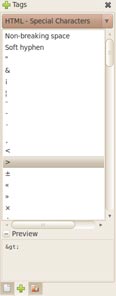
  • "Tags" that allow you to insert html snippets and obscure html entities you would have to google for
  • Code snippets of quite a lot of languages
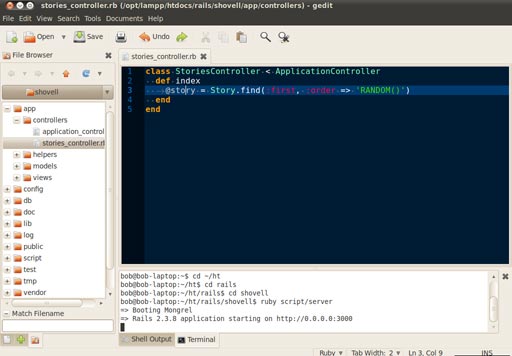
  • You can open a terminal in a bottom pane to start your ruby server (one window less to alt-tab to :) )
  • More .. syntax highlighting, auto indenting, matching brackets, indicators of the amount of spaces used, bookmarking of lines of code
  • And more .. I still didn't check all plugins

Old news for some and yeah.. "all editors have that, no?!"
Well might be, but Gedit is superlight and things don't stand in your way.

Conclusion, why Gedit (or Textmate on the Mac) ?

For me, like TextMate, this is the perfect solution because I hate heavy memory-consuming (slow) IDEs.
VI(M), although I like it for its diehard keyboard-only control, is not ideal for cut/copy/paste pieces of texts around (or I need to read the Vim Oreilly book and post a VI crash course here, I might do that one day ..)

Hope this is useful for some Linux / Ubuntu / Gnome users

Some printscreens of how this looks:

-- terminal in bottom pane


-- find HTML entities, new menu option with KB shortcuts, dots/ space-bar indicators

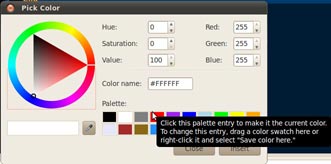
-- pick a color and it is translated to its hexadecimal code which you can insert into your code


Ruby on Rails – first steps

Ruby on Rails? .. yes, I started to learn Ruby on Rails (abbr as ROR)!
It's quite a challenge and honestly it's not the first attempt.
but .. the water is not that cold after all :D

So why taking this challenge?

Well.. Ruby is a strong and sexy OOP language and Rails embeds the MVC architecture
When dealing with more complex projects a MVC approach is inevitable

MVC stands for Model-View-Controller and allows your web app to be structured in a more logical way:
-the model handles the data (database)
-the controllers the application logic
-the views the presentation logic

Some advantages of MVC are scalability, easier maintenance and re-use of code. When using it for a while I will expand on this ..

A good intro on ruby on rails and the MVC architecture -which surprisingly enough has been around for over 30 years!- can be found here. Build your own ruby on rails web applications, by the same author, is a good intro. I started to read it this weekend, although terribly busy, I am one third through, because it is accessible and to-the-point.

Installation

You need to take several steps to get ROR up and running on your system, depending the OS you are running.
Basically you need to:
- install rails
- install rubygems*
- install rails via gem
- install mysql
- install ri (optional; documentation)

* this is the name of the app. When installed, you run $ gem .. from the command line interface (aka terminal).
It a ruby app or package manager, compare it to "port" on the Mac or "apt-get" on Ubuntu.

I had some compatibility issues between the various apps on Linux and Mac (mainly Mysql config).
I found some useful links I want to share:
- Ubuntu: all errors could be found + solved here: http://rbjl.net/20-rubybuntu-2-troubleshooting-common-ruby-ubuntu-problems
- Mac: comes with ruby + rails, less work here. You might have an issue with Mysql when starting your freshly created webapp: in your terminal where you start the app with "ruby script/server" you see uninitialized constant MysqlCompat::MysqlRes and a lot of spam after that. Installing Mysql via "gem" with the following flags helped - thanks to this tip

sudo env ARCHFLAGS="-arch x86_64" gem install mysql -- --with-mysql-config=/usr/local/mysql/bin/mysql_config

Just some observations from a guy stubbing his toe in the swimming pool :D

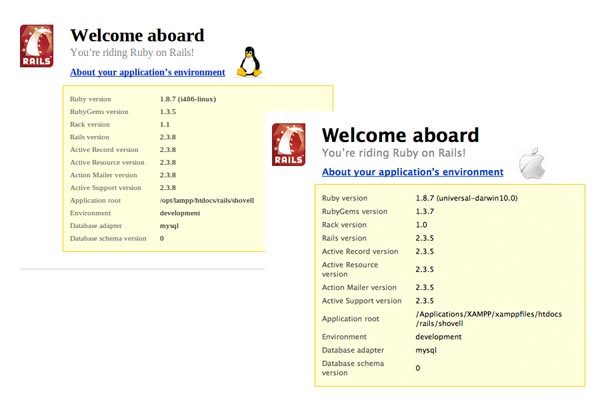
[caption id="attachment_114" align="aligncenter" width="600" caption="installed ruby on rails on mac and ubuntu"]installation ok[/caption]

Prepare for next months..

The links below are far better in explaining the installation process and first steps with ROR

In the (near) future I'd like to dedicate 3 posts to:

1- the ruby programming language
PHP is fun, it's powerful, it's comfortable, somebody I can laugh and cry with, but it has its limitations and OOP was put on top of it.
Ruby is natively OOP, it's compact and it seems very smart and in conjunction with rails it's very powerful.

2- the rails framework
More on MVC and its practical implications doing web development.

3- my first rails app

.. if you're interested just follow the "New blog post" notices @bbelderbos

Useful sources

So you also want to ride Ruby on Rails ?
Here are some useful links:

Making websites load faster

Today there are still limits in downloading files from the web server to the local browser.

Some tips:

a- as the browser can only make a limited number of requests at one time you have to limit them.
put all JS and CSS together in less files possible.

b- compress the code. this is a slight saving, but every kb helps especially if you consider the cost of bandwidth on a multi-user app

c- use sprites combining multiple images into a single image.
I still have to experiment with this option

d- put javascript files at the bottom; you will see the html/css/images much faster

e- download the yslow plugin for firefox to test and check some other features.

Adding some progressive enhancement

Playing around I disabled CSS and Javascript on my site:

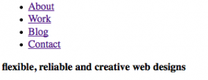
browsing my site with css and js off

Hm.. what's the problem? Well .. it is presentational stuff that shouldn't show up in a html-only view. A mobile device user will have to scroll through these image. An iphone would be served better with only text and maybe some small images.

Cause? - I naively put images (img tags) into my html, this way mixing content with presentation. First I got the images out so that html-only view would not show them:

.. far more compact for a mobile device. Under the phrase, the text starts,
saving mobile device users a lot of scrolling.

Then I used CSS to put one image when only CSS was on:

.slideshow { position: relative; float: right; height: 150px; width: 425px;
background:url("../images/bambu/bambu4.jpg") no-repeat top left; }

This way, when there is CSS one image is shown occupying the class the slideshow div in the html document.
Then the full solution, bonus for the people (still the majority of course) that has Javascript turned on. The key is to let Javascript do all the work:

1. add the images with JS storing them in a variable

var imagePresentation = '
<img src="images/bambu/bambu1.jpg" alt="banner with photo slideshow of bambu trees"/>
<img src="images/bambu/bambu2.jpg" alt="banner with photo slideshow of bambu trees"/>
<img src="images/bambu/bambu3.jpg" alt="banner with photo slideshow of bambu trees"/>
<img src="images/bambu/bambu4.jpg" alt="banner with photo slideshow of bambu trees"/>
<img src="images/bambu/bambu5.jpg" alt="banner with photo slideshow of bambu trees"/>';

2. add them to the document object model (DOM)

$('#slideshowImages').append(imagePresentation);
(#slideshowImages = the container division reserved for the images.)

Now we have a good result for all three layers of the progressive enhancement model:
1. mobile devices or text-only browsers see only text. There is an empty #slideshowImages div block, that you could take out as well, but I use that for my CSS
2. browsers that have CSS turned on but not JS have a single background image in the banner:


3. browsers that support CSS and Javascript see all 5 images rotating - see my site. By the way, the rotation of images is thanks to the jQuery Cycle Lite Plugin


Conclusion
: temptation is to put presentational stuff in too early. But knowing that at the end of the day, you have to go back to make hacks for wider compatibility, why not start at the very basic: the document structure (html). Then add a presentational layer with CSS decorating the content. At last put some interactive functionality adding Javascript. This way, you can at least be sure that all will work in a wide range of browsers even if Javascript or CSS is not there.

I need to check my site for more of these drawbacks. Probably I will add a stylesheet in the future to optimize for mobile devices. You can easily target these devices doing something like this:

<link rel="stylesheet" type="text/css" href="iphone.css"
media="only screen and (max-width: 480px)" />
<link rel="stylesheet" type="text/css" href="desktop.css"
media="screen and (min-width: 481px)" />
(from Building iPhone Apps with HTML, CSS, and JavaScript ..
from Jonathan Stark)

If you want to know more about progressive enhancement there is a good article at Sitepoint: where javascript fits in
Next post on IE6 quirks. IE6 might be dead, there are still visitors of my site with this browser and I need to make some adjustments to give them the same experience as the IE7+ users.

Dropbox for file syncing

And now something totally different ..

I rediscovered this cool tool listening to the Sitepoint podcast. This is a great free app that gives you 2g of central storage. Of course you have to accept your files will be hosted on Dropbox' server (same trust you grant when using google services), but it is quite handy for personal pdfs, notes etc.

Old news for some of you, what was new for me though were these two cool features:

  1. If you have more systems  you sync files much faster thanks to LAN syncing
  2. Plugin for use on your ipod/iphone - and it quite smart: it lets you directly read your docs online but only downloads them to your ipod if you star them as "favorite", so that prevents Dropbox from eating up precious MBs on your device (I found this info on the FAQ page)

Original form design

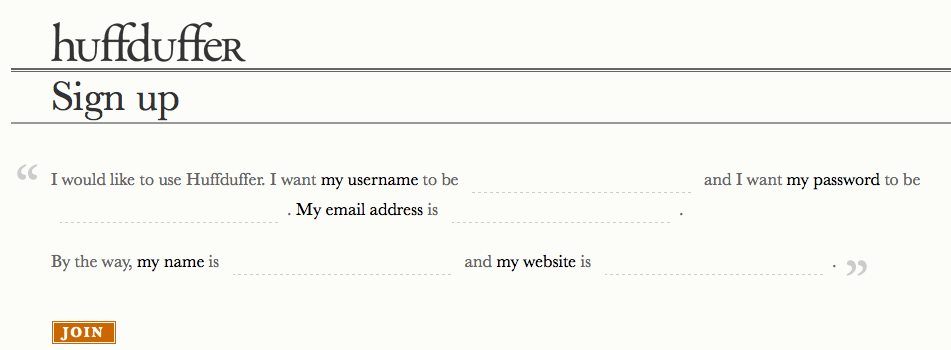
I just stumbled upon this article: "Mad Libs" Style Form Increases Conversion 25-40%

Quite amazing how a redesign can lead to a greater response. It makes sense though, a lot of forms on the web are boring. Making it a story or apply some creative styling makes it much less cumbersome to submit information.
It stresses once more you should design with the end-user in mind. What for you seems a one-minute form could be a real pain for the end user. Making it attractive, fun or offer something in return will increase returning visitors.

example more fun form

Outputting system commands

I had some struggle to properly output/format server outputs. I've always been a fan of automating stuff with bash, awk, etc. but need the browser to present the results and let the user interact. With C's printf you can easily get a nice terminal output like this:
column        |        column        |        column        |        column

But when echoing this to a browser with PHP you typically get:
column |column|column| column
column_different length |column|column| column

- that doesn't line up well. So you try to wrap it up in a html table, but what if the columns need to be of a different length? This is not easy

I found a very easy solution to this problem: wrap the whole output in <pre></pre> tags and it will retain the original (txt) command line output. Hours of structuring and styling.. how could I overlook this simple html tag?

Second interesting thing I discovered is PHP's system() command that outputs to the browser in real-time. For example a dotted progress bar could be simulated with:

while (TRUE) {
system('echo .');
sleep(1);
}

.. imagine the line-by-line output of a long script with data that is gathered over the net- that is a very verbose way to communicate with the user, just if he/she was using the command line. Much more informative then a simple (although elegant) ajax loader (http://www.ajaxload.info/)

So just this quick post to share these tips if you're making apps based on backend unix power scripts.

Chrome for web development

Apart from Firefox I started using Chrome. It's very neat and fast, but sometimes you note it's still new and doesn't have the years of experience of Firefox. You have to get used a bit (I disabled automatic Google search), but once you're set it might happen you don't open Firefox for days ..
.. till you need to build / debug a website - where are firebug and the web developer toolbar please? Well.. chrome has some interesting extensions as well. I just got the 5 URLs in my inbox (I subscribed to the sitepoint newsletters). I summarize them here, because I think they are a must use for every designer deciding to give Chrome a chance:

Let's see the coming weeks if it really holds up against the web developer toolbar and Firefox' firebug.